
Black Dog Saloon & Mezcaleria aka B.D.S.M. is a very popular high-end dive bar in Cork and sister bar to Vicarstown Bar on North Main Street. From interior elements to signage design, posters, advertising, menus, matchbooks, tee-shirts and more, this has been a labor of love! The entire visual identity is mine (sadly the bar isn't) ;-)
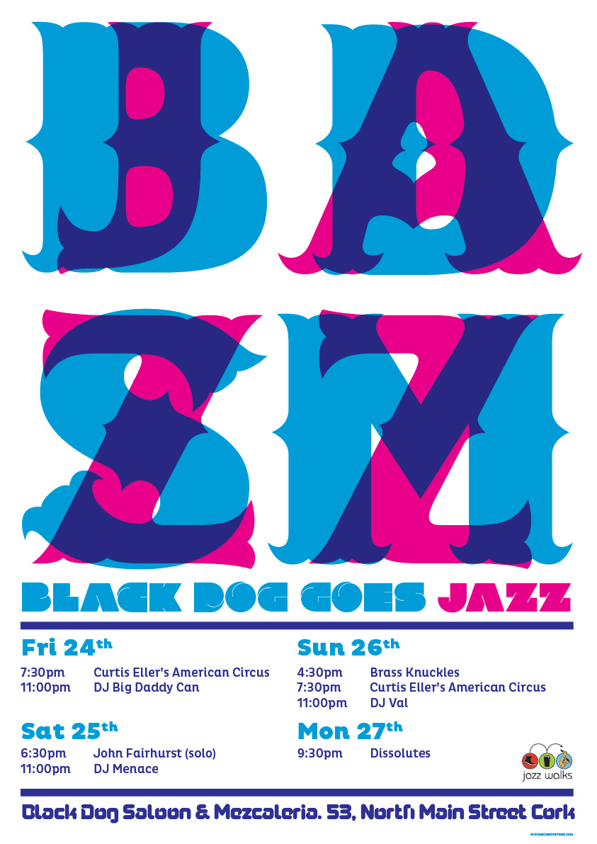
The posters and images below go from relatively recent to the original designs where we worked within the constraints of a single sugar skull. A progression of sorts can be traced. One of my favourite changes was from the wide design of the B.D.S.M. to the more square version of two letters up and two down. Enjoy.

A tee design encorporating a heavily reworked piece of stock from one of my Vicarstown & B.D.S.M. joint event posters. Note how the branding is hidden yet the tee proved succesful.

Based on a not-quite-remembered illustrated book of The Torture Garden, this was one of those free reign moments.
With considerable time constraints and a lack of agreement on imagery, this was a perfect time to make a little homage to something great that came before. With a little shoe-horning it worked too, or I like to think it did. It remains one of the most visible posters for the bar to date.

Any excuse to return to a zombie hand bursting forth from hallowed earth... I have used this motif again and again and this is still one of my favourites. The text is mostly Samdan, a cheeky throwback to my Gypsy Hotel playbills of yore.

Sometimes when there's nothing you need to say with words it's a great excuse to make something pretty. i enjoyed playing with perception here. Adding the grain was something that elevated both this image and the poster abobve from their original artworks. Sometimes grain unifies the elements in a poster greatly, bringing it all together at th end.

Influenced equally by a mental year working with Niall Sweeney in the '90s and the more recent work of Shepard Fairey, this happily sailed through the newspapers and other publications at the time. The patterns are an element I very much wish to revisit in upcoming work.

Zardoz and Japanese prints had more than an influence on this. Not my first take on the theme. Interestingly though it marked my changing the "logo" and basing it on a block print. This has proved significantly more viable for posters and tees.

This was our only piece of advertising deemed too risqué to go to print, by a very good natured Cork News. With the exception of one similarly executed Gypsy Hotel poster featuring Missy Malone as The Bride of Frankie, this is porbably the most painting I've ever done on one poster.

Using the previous Paddy's Day poster (below) as an inspiration, Ipainted this image digitally using a scan of a model's face from a 1950s magazine ad as source. She certainly had no makeup or tattoos when she started off. One can't but wonder if she'd recognise herself. The Blackletter was inspired by the wonderful book of the same name, containing photos of hand-painted blackletter signage around contemporary Mexico.

Not entirely inexplicably, Saint Patrick "driving the snakes out of Ireland" TM still grinds my gears. This was a nice opportunity to subvert just a little, the traditional St. Patrick's Day imagery by replacing the Shamrock with snakes. The Snakes old Paddy drove out were symbolic of our old gods, our pagan heritage. To this day people celebrate a Welshman leading the church to Ireland.

From the Facebook page, a snap of the cocktail menu.

This, I believe, was the last strictly black and white skull poster. though the skull re-appeared for the painted posters, it gradually ran its course (for me at least). There was a handmade aesthetic that we had been aiming for from the beginning that came to fruition in this poster, just in time to change it.

This was the first introduction of colour into the project. I was very pleased with it. It also marked the surreptitious introduction of the letter E into the now correctly spelled Mezcaleria. You'd think someone would have noticed. A very helpful Mexican customer did. Not too soon either, shortly after this, Mexico's Ambassador to Ireland visited the bar. Great guy!

Not a lot to say, technically, about this early example of our "Welcomes to" posters. Except perhaps, that the gentleman pictured has one of my posters, depicting his Irish heritage in music, hanging in his office. Yup, framed 'n all.


The very first poster for this incarnation of The Black Dog, became this. interestingly, the skull artwork was mocked-up as a background for another piece and never intended for front and centre use. I was never overly fond of the abbreviated name, but I'm a stickler for full titles.

Three different staff t-shirt designs, with the original tee visible at centre.

Many elements of the interior, such as the B.D.S.M. text on the fridges and some of the many tchotchkes and kustom kulture elements in the bar were designed by me either for this venture or its previous intented incarnation at another location.
The Black Dog Saloon & Mezcaleria remains one of my favourite projects to date. At some point I may show the original artwork for the bar, as envisioned in its original incarnation.


